Interesting Color Names: Intermediate Shades
Imagine waking up one day and realizing that colors no longer exist. How incomplete everything would feel, right? Colors are a phenomenon that make many moments in our lives unforgettable and guide our emotions. In nature, colors play a major role in creating the most beautiful landscapes. They are a crucial factor in the fashion world, setting trends each season; in architectural design, giving spaces entirely new identities; and even in influencing our moods.

Interesting Color Names: Intermediate Shades
Imagine waking up one day and realizing that colors no longer exist. How incomplete everything would feel, right? Colors are a phenomenon that make many moments in our lives unforgettable and guide our emotions. In nature, colors play a major role in creating the most beautiful landscapes—the blooming flowers and sunlit green branches of spring, the pale tones of fallen leaves in autumn, the deep purple crocus emerging from snow-covered winter soil, or the magical dance of colors brought to life by an artist’s touch. Colors are also a crucial factor in the fashion world, setting seasonal trends; in architectural design, giving spaces entirely new identities; and even in influencing our moods.
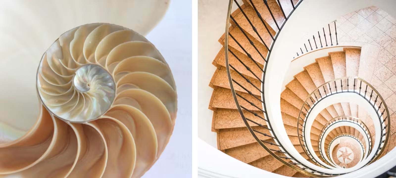
It is generally accepted that there are three primary colors (yellow, red, and blue) and three intermediate colors created by mixing them. Purple comes from combining red and blue, orange from red and yellow, and green from blue and yellow. While black and white are not considered colors, they play a role in forming thousands of intermediate shades. The tones we perceive may be almost infinite, as they depend on factors such as the color and intensity of light, the structural properties of the material, and even the physical characteristics of the observer.
Colors often help us form emotional connections with objects, spaces, and even people, animals, and plants. When describing memories or dreams, they are usually the first thing that comes to mind. Some colors are so impactful that we feel the need to give them specific names. While intermediate shades may not be the first colors we think of, they occupy a significant place in our lives. Those familiar with these nuances may recognize their names. Yet, sometimes, we struggle to name the exact tone we imagine and resort to references from nature or our surroundings. If you find it difficult to define the tone in your mind, the following interesting color names can help you express the shades you envision.
Stories of Rare and Unusual Colors
The world of color is not limited to primary and secondary hues. There are rare colors and distinctive color names, each with its own unique story, intriguing origin, or cultural significance. Here are some of them:
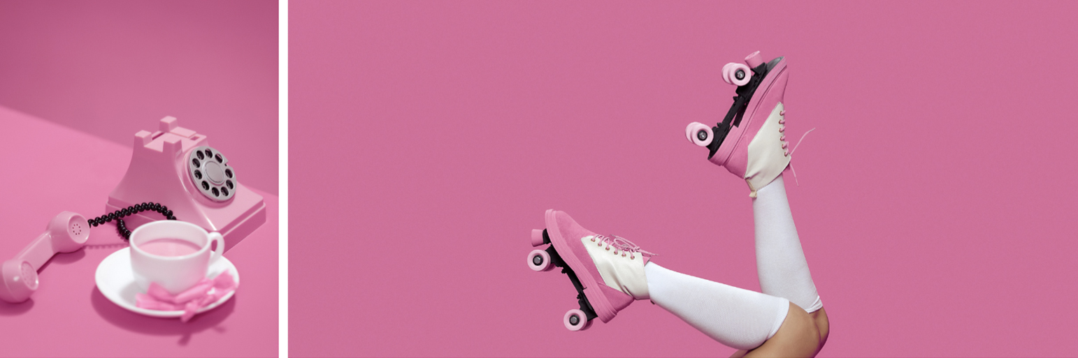
Barbie Pink
Particularly familiar to those who grew up in the ’90s, ‘Barbie’ is back in the spotlight with the upcoming Barbie movie. First launched in 1959, Barbie dolls brought this playful, dreamy, and sweet candy-pink tone to life. This iconic shade, frequently used in the imaginative universe of Barbie, has become so associated with the brand that it is now listed in Pantone catalogs under this name.
School Bus Yellow
This bright yellow, used for American school buses, was first introduced in 1939 by Columbia University’s Teachers College. Created with lead-based chrome yellow pigment, the color was chosen for school buses because it attracts attention and is easily noticed in traffic. In April 1939, Professor Dr. Frank W. Cyr from Columbia University held a conference in New York, officially naming this yellow tone “National School Bus Chrome.” Still the official color of school buses today, School Bus Yellow has become ingrained in American cultural memory and is instantly recognizable thanks to its iconic presence in Hollywood films.
Edirne Red
Edirne, which served as the Ottoman Empire’s capital for 88 years, is one of Turkey’s culturally significant cities. Home to Mimar Sinan’s masterpiece, the Selimiye Mosque, this city has also lent its name to a shade of red. Known in French as “Rouge d’Andrinople,” Edirne Red dates back to the 15th century. The color was first produced as a root dye in Edirne, later brought to France, where its production began in Paris in the 1740s. Used extensively in textiles, Edirne Red continues to be valued today, with efforts underway to cultivate the Rubia tinctorum L. plant for its production.
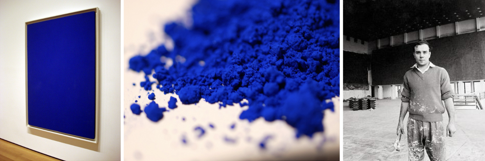
Klein Blue
Did you know that French Nouveau Réaliste painter Yves Klein, born in Nice in 1928, has a color named after him? Known globally as ‘IKB’ or International Klein Blue, this deep, matte blue became Klein’s signature. Born to a figurative painter father and an abstract painter mother, Klein first exhibited in 1955 and frequently used this intense blue tone. He described it as “the dark tone of electric blue,” believing it expressed the color’s essence perfectly. Klein patented this color in the 1960s, and it became a hallmark of his legacy. While you may not own an original Klein painting, you can incorporate this color into your interiors—on walls, furniture doors, or combined with copper, brass, or contrasting objects—to create a striking ambiance.
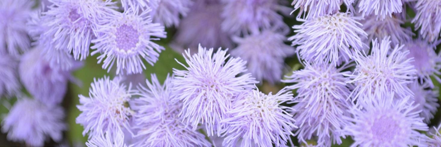
Smoke of the Ferry (Vapur Dumanı)
Contrary to what the name might suggest, this color is not inspired by the ferries of the islands but by a flower native to Central and South America. The Smoke of the Ferry flower blooms in spring with cascades of purple, blue, and white flowers, reaching about 30 cm in height. Its spherical flowers resemble clouds of smoke, inspiring the grayish-lavender intermediate shade named after it. Even without a garden, you can bring this lovely tone into your home by painting a wall with Smoke of the Ferry.
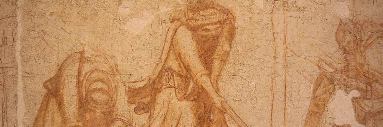
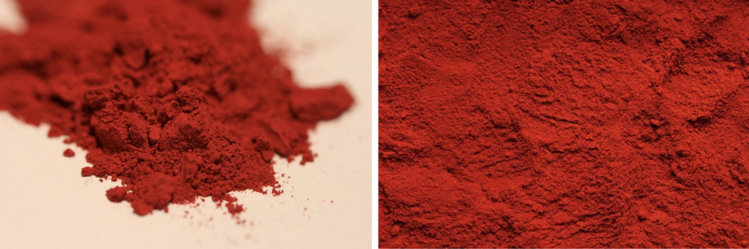
Sinop Red
A must-see during a trip to Pisa is the Sinopie Museum. Though located in Italy, the museum is named after Sinop in Turkey, which played a role in Black Sea trade and was an important Byzantine port. Sinop Red, or Sinopia, is an earth pigment exported from Sinop to Europe for painting in the Ancient, Medieval, and Renaissance periods. Used for fresco preparations, some restored sketches are now displayed in the Pisa museum. In Anatolia, Sinop Red, also known as Sinaper, was historically used for body painting, figurines, and cave art.
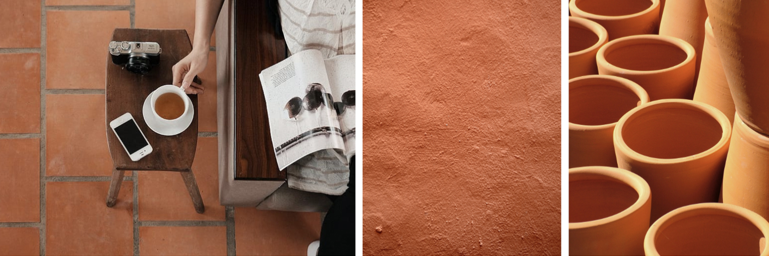
Terracotta
Italian for “baked earth,” Terracotta is widely recognized in architecture and design. Used for everything from pots and tiles to building materials, Terracotta is especially popular for flooring due to its durability, resistance to mold and bacteria, and warm reddish-brown tones. Terracotta floors can create a calm and inspiring atmosphere when paired with wooden furniture, woven rugs, baskets, and ceramic objects.
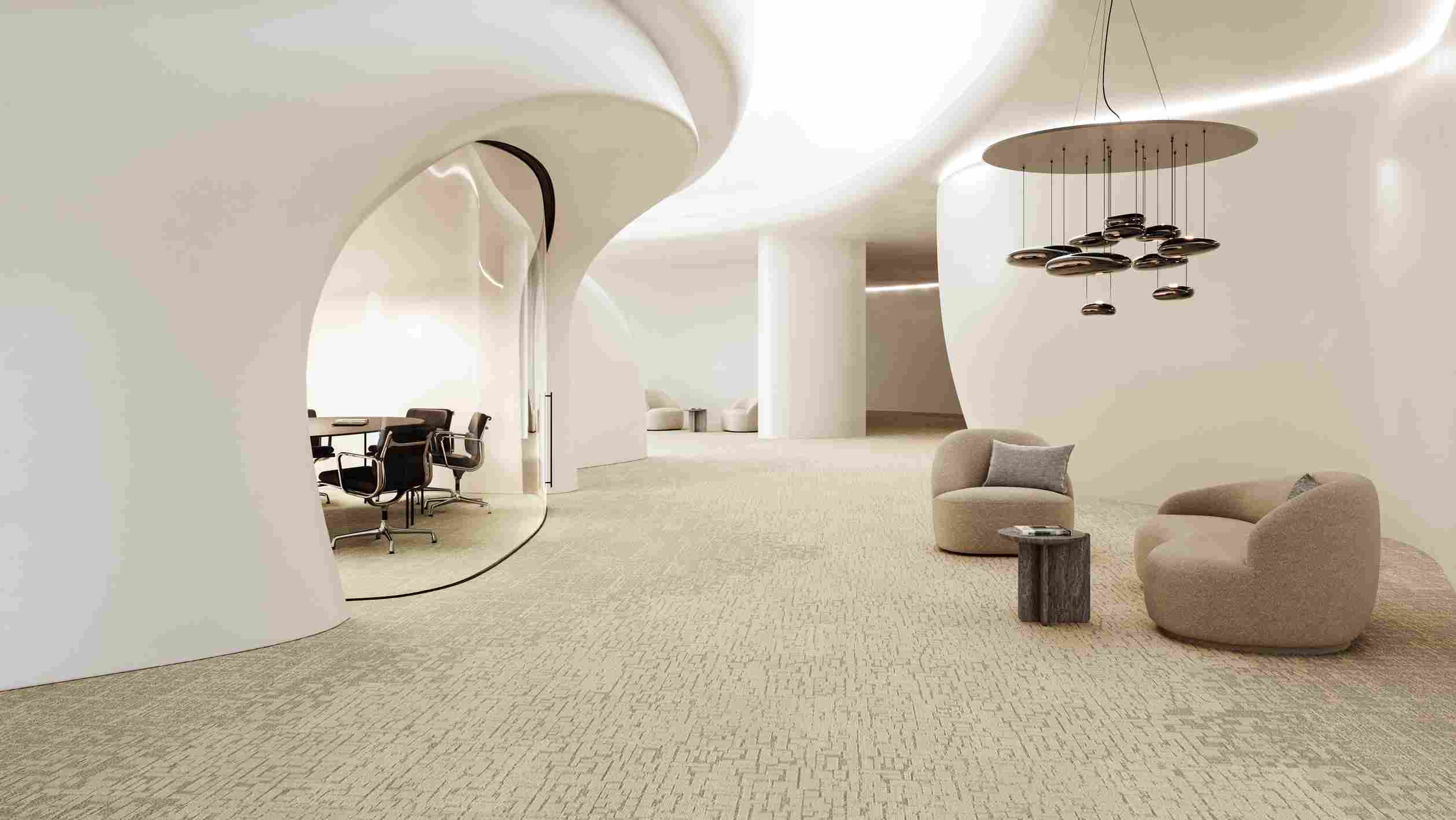
Nature-Inspired Color Names of the Dickson® Mirage Collection
Mirage, the woven vinyl flooring collection by Dickson® within Unigen’s flooring solutions, stands out with its rich tones and distinctive color names inspired by nature. Among the eight new colors enriching the collection, neutral shades such as Moon, Polar, and Betula; lighter tones like Shell, Umber, and Sepia; and warmer options including Orpiment and Serandite offer a wide spectrum of choices. In addition, the collection features poetic color names carefully selected to reflect the visual richness of the products:
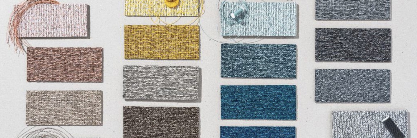
- Nimbus Beige:
This distinctive color in the Dickson® Mirage Collection is a harmonious blend of soft and warm beige tones that adds an elegant and calming touch to any space. Formed by the combination of beige shades such as Taupe and Linen, Nimbus Beige features a subtle and sophisticated palette reminiscent of rain clouds. By adding depth to the floor, it creates a timeless and refined atmosphere. - Persian Yellow:
Persian Yellow is a mystical and striking pattern created by the fusion of saffron, amber, and mustard tones. Representing calmness, serenity, and depth, this bold color transforms into a vibrant texture under the influence of light, much like shimmering grains of sand. With its earthy and yellow undertones, it brings a sense of tranquility and nourishment to the soul. Suitable for both modern and traditional interiors when paired with the right décor and accessories, Persian Yellow brightens spaces while adding warmth and joy. - Merlot Red:
Named after the Merlot grape cultivated in France and renowned for the wines of the Bordeaux region, this sophisticated pattern reflects the rich and captivating color spectrum of Merlot grapes on the vine. Featuring deep and intense red tones commonly associated with elegance and passion, the design evokes the feeling of walking through vineyard gardens in France, shaped by varying intensities and nuances of light. - Arizona Bronze:
Arizona, located in the southwestern United States, is known for its vast cactus-covered deserts, sandstorms, canyons, rivers, and striking natural landscapes. Designed by Dickson, Arizona Bronze draws inspiration from the rich earth tones of the Arizona Desert. Its vibrant and embossed structure adds depth to the surface, while the interplay of subtly luminous earth tones and darker shades enhances the color palette. The result is a warm and inviting flooring solution.
Unigen at Every Step
Finding the right color and texture in flooring materials is crucial for architects to achieve the desired spatial effect. Unigen’s wide product range offers designers hundreds of options in color, form, and texture. With guidance from Unigen’s expert team, you can select flooring in your dream shades and shape your projects according to your unique taste.
FAQ
How can lesser-known colors be used in home décor?
When using lesser-known colors in home décor, it’s best to think of them as accent colors rather than primary ones to achieve a balanced aesthetic. For example, you might paint a single wall in an unusual shade such as steamboat smoke, or choose terracotta tones for furniture. Using distinctive colors like Klein Blue or Edirne Red in accessories (such as vases or artwork) can add depth and personality to a space.
Why are rare colors special, and where can we find them?
Rare colors are special because they are often derived from natural pigments or produced through unique manufacturing processes, each carrying its own distinctive story. They offer a sense of depth and character beyond ordinary tones. Such colors can be found in the catalogs of specialty paint brands, art supply stores, or in the collections of flooring brands like Unigen. In particular, products such as the Dickson Mirage Collection feature inspiring examples of truly distinctive color palettes.
Discover